Topic: DMD0219

Ladder Views
In the image below, the area outlined in red is the section of the Do-more Designer programming software known as the View List and the View Display area. The View List will contain a tabbed entry for each of the different views that are open. The Ladder views are one type of views that will appear in this section. Ladder views are used to display the ladder logic within each of the code blocks that exist in a project.
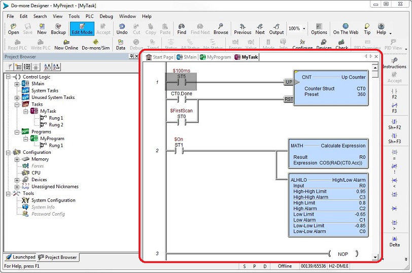
Each code block (Program, Task, etc.) in a Do-more Designer project will be displayed in it's own tabbed ladder view, meaning that any time a code-block is opened for viewing, there will be a tab - with the code-block's name in the tab - created in the view list.
Note: the order of the tabs within the view list can be changed by clicking on a tab and dragging it left or right to the desired location.
Navigating within a Ladder View
Scrolling forward and backward through a Ladder View can be done with the Up arrow and Down Arrow keys, the Page Up and Page Down keys, with the Drag Bar that is located on the far right edge of the Ladder view, or with the scroll wheel on the mouse.
Navigating within the individual rungs in the Ladder view is done with the cursor keys (up, down, left, right) which will move the cursor one program element in the direction of the cursor key.
The Find Element or Instruction utility can be used to search through the current code block or through all the code blocks of the currently open project for a particular program element or a particular type of instruction.
The Go To Address or Rung Number utility can be used to move the cursor to the specified location in the specified code block.
Ladder View Display Options
The Ladder tab of the Options dialog sets the display options for Ladder Views. The Options dialog can be invoked by clicking the Options button on the Offline toolbar, or a right-click in the Ladder view and selecting Options from the right-click menu. The Ladder Options dialog has two tabs, one with Display and Status Options, and the other with Editor and Mouse options.
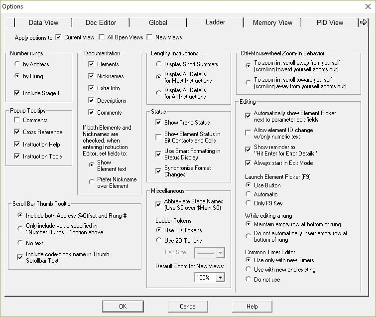
Apply Options to: specifies which Ladder Views the option changes will be applied to (multiple options can be selected).
Current View option changes will be applied ONLY to the Ladder View that was active when the Options dialog was opened.
All Open Views : (if Ladder Views for multiple code blocks are open) the same option changes will be applied to all of the open Ladder views.
New Views option changes will also be applied to Ladder Views that are opened in subsequent programming sessions.
Number rungs ... specifies how rungs are numbered
-
by Address : all of the rungs in the Ladder View are numbered with the address of the first program element on that rung.
-
by Rung (default) : all of the rungs in the Ladder View are numbered sequentially, beginning at 1.
-
Include Stage #) : for rungs within Stages, the Stage Number will appear just above the rung number.
Documentation specifies which pieces of project documentation to display in the Ladder View.
Note: the "Ctrl + /" key combination will temporarily toggle the display of all project documentation in a Ladder View.
Elements displays the memory locations used in the instructions.
Nicknames displays the Nicknames assigned to the memory locations used in the instructions.
Extra Info displays the Wiring Info assigned to the memory locations used in the instructions.
Descriptions displays the Descriptions assigned to the memory locations used in the instructions.
Comments displays all of the Rung Comments for the code block.
If both Elements and Nicknames are checked in the above selection, the next options specify which of the two to use in the Instruction Editors:
Show Element Text this selection will always show the Element text even if the Element has a Nickname.
Prefer Nickname over Element this selection will show the Nickname instead of the Element text.
Lengthy Instructions ... : for instructions that have a variable number of rows (e.g. INIT - Initialize Data, RAMPSOAK - Ramp / Soak Profile, etc.), this option allows the programmer to control how much screen real-estate and the number of printed pages that is consumed by these instructions.
- Display Short Summary will display the smallest amount of information that is practical, typically this will be the first couple of rows and the
last couple rows in the instruction.
- Display All Details for Most Instructions (default) will always display every row for the majority of these instructions because there are only
a few that always use a lot of screen real estate and printed pages.
- Display All Details for All Instructions) will always display every row of these instructions, regardless of the amount of screen real estate or number of printed pages that is required.
Misc. Options are additional display options that are available.
Abbreviate Stage Names (Use S0 over $Main.S0) : if enabled (default), in instructions that reference stage numbers, fully-qualified Stage numbers are displayed, that is, the Program name and the stage number. If disabled, only the Stage number is displayed..
Ladder Tokens selects how elements in the ladder diagram are drawn.
- If Use 3D Tokens (default) is selected , three dimensional effects are applied to program elements when they are displayed in the Ladder view.
- If Use 2D Tokens is selected the effects are not applied and you have the option select the Pens Size used to draw the 2D tokens.
Default Zoom for New Views sets the default zoom level for all newly created Ladder View tabs. Select a Zoom level of 35%, 55%, 65%, 75%, 85%, 100% (the default), 125%, 150%, 175%, 200% or 225%.
Status options that control how instructions are displayed when runtime status in turned ON.
Show Trend Status : if enabled (default), mini-trend are displayed at the bottom of instructions that support them (e.g. ALHILO - High / Low Alarm, PID - Closed Loop Controller, etc.). If disabled, the mini-trends are not displayed.
Show Element Status in Bit Contacts and Coils : if enabled (default), the status display for Contacts and Coils that reference BIT locations will show the Element name and the ON / OFF status as well as the power-flow status. If disabled, only the ON / OFF status will not be displayed, only the Element name the power-flow status will be displayed.
Use Smart Data Formatting in Status Display : if an instruction parameter is a structure element whose value can be displayed in a more human-readable format it will be displayed in the better format. For example the parameter is a DWord value that represents a Date, or a Time, or an IP Address, the Status display will show the value in the better format.
Synchronize Format Changes : when changing the Status display format of a parameter, also change the display format of the other parameters in the instruction. For example, if you change the display format of one parameter in a relational contact, change the display format of the other parameter to the same format.
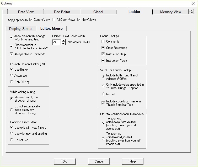
Allow Element ID Change with only Numeric Text : for instruction fields that allow constants, simply typing a number will replace all of the contents of that field with the typed number (similar to how DirectSOFT worked).
Show Reminder to "Hit Enter for Error Details" : if checked the text "Hit Enter for Error Details" will be displayed in the instruction's title bar .
Always start in Edit Mode : if checked will automatically put the Ladder View into Edit Mode each time the Ladder View is opened.
Launch Element Picker (F9) options select what action will open the Element Picker dialog when editing an instruction:
- Use Button (default) means the Element Picker dialog will not open automatically; you will need to click on the "three button" graphic to the right of the parameter field to open the Element Picker.
- Automatic means the Element Picker dialog will open automatically; the "three button" graphic to the right of the parameter field is NOT displayed.
- Only F9 Key means the Element Picker dialog will not open automatically; the "three button" graphic to the right of the parameter field is NOT displayed; you will need to press the F9 key top open the Element Picker.
When Editing a Rung the following options apply:
- Maintain Empty Row at Bottom of Rung - (default) : any time an element on a rung is edited, a blank row will automatically be added below the rung .
- Do Not Automatically insert Empty Row at Bottom of Rung : no rung will automatically be added.
Common Timer Editor options select when the Common Timer Editor is used instead of the Timer's specific instruction editor.
- Use Only with New Timers (default) means the Common Timer Editor will only be used to create new Timers, but subsequent editing sessions will use the type-specific editor.
- Use with New and Existing Timers means the Common Timer Editor will be used to create new Timers and used with any subsequent editing sessions of any Timer.
- Do Not Use means always use the type-specific editor for the new and existing Timers.
Element Field Editor Width sets the maximum of characters that will be displayed for each parameter field in the instruction editors. This makes editing long parameter names (for example : MyBlock[MyIndex].MyStructure.MyField ) much easier.
Characters (16 - 48) sets the field width value from 16 to 48 character, with the default being 24 characters.
Popup Tooltips enables / disables the pop-up tool tips that are displayed when the mouse cursor hovers over specific areas of the Ladder View.
If Comments is enabled this tooltip is displayed when the mouse cursor hovers over the empty space just above each rung.
If Cross Reference is enabled this tooltip displays the cross reference information for the memory location use when the mouse cursor hovers over any memory element in the Ladder View.
If Instruction Help is enabled this tooltip displays information from the Help topic for the instruction under the cursor when the mouse cursor hovers over any program element (contact, coil, box, etc.) in the Ladder View.
If Instruction Tools is enabled this tooltip displays links to utilities on Do-more Designer that can assist in using this instruction more effectively or more efficiently.
Scroll Bar Thumb Tooltip controls what information is displayed in the popup tooltip when moving the scroll bar thumb wheel.
- Include both Rung # and Address @Offset (default) : the popup tooltip will display the both the Rung number and the Address of the first element used
on that rung.
- Only include value specified in "Number Rungs..." option above : the popup tooltip will display the either the Rung Number or the Address of the first
element used on that rung.
- No Text : the popup will not be displayed.
Enable Include code-block name in Thumb Scroll bar Text to include the code-block name in the popup tooltip.
Ctrl+Mousewheel Zoom-In Behavior sets the zoom behavior when using the CTRL key and the scroll wheel on the mouse.
- To Zoom In scroll away from yourself (scrolling toward yourself zooms out).
- To Zoom In scroll toward yourself (scrolling away from yourself zooms out).
Themes ...
The Select Visual Theme dialog is used to select from a list of predefined display configurations that control how the toolbars, buttons, menu items, etc. are displayed. The Select Visual Theme dialog is invoked through the View -> Themes ... selection of by clicking the Themes button on the View toolbar.
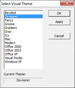
Select a Theme from the list by and click the OK button to start using it and close the dialog, or click the Apply button to start using the theme but leave the dialog open, or click Cancel to close the dialog without changing the current theme.
Color Setup ...
The color setup dialog is used to configure custom colors for various program elements. The Color Setup dialog is opened with the View -> Menu selection of by clicking the Colors button on the View toolbar.
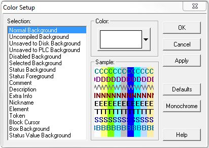
To change the color of an item, position the cursor on the item to be changed, and select the desired color for the color palette. The sample in the lower right of the dialog shows how the foreground and background colors will look in the views.
Click the OK button save any changes made to the color configuration and exit the dialog. Click the Cancel button to exit the dialog without saving any changes made to the color configuration. Click the Apply button save any changes made to the color configuration and exit the dialog.
Click the Defaults button to reset all of the colors back to their installation defaults. Click the Monochrome to set all of the colors to black and gray on a white background. This may be useful on monochrome LCD displays or for black and white print-outs.
Split Screen Bar
There may be times when the programmer wants to view more than one part of the same code-block at the same time. Do-more Designer has a split screen feature that allows the programmer to split the program, horizontally, into two panes.
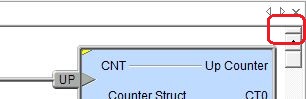
In the image above, the Split Screen bar is located in the right-hand corner of the Ladder View. To split the screen, position the mouse cursor over the Split Screen bar, then press and hold the left mouse button. When the cursor changes to a parallel bar move it down to bring the split screen into view and size the screen to your convenience. Each pane of the Ladder View can now be navigated separately to view different rungs of the same code block.
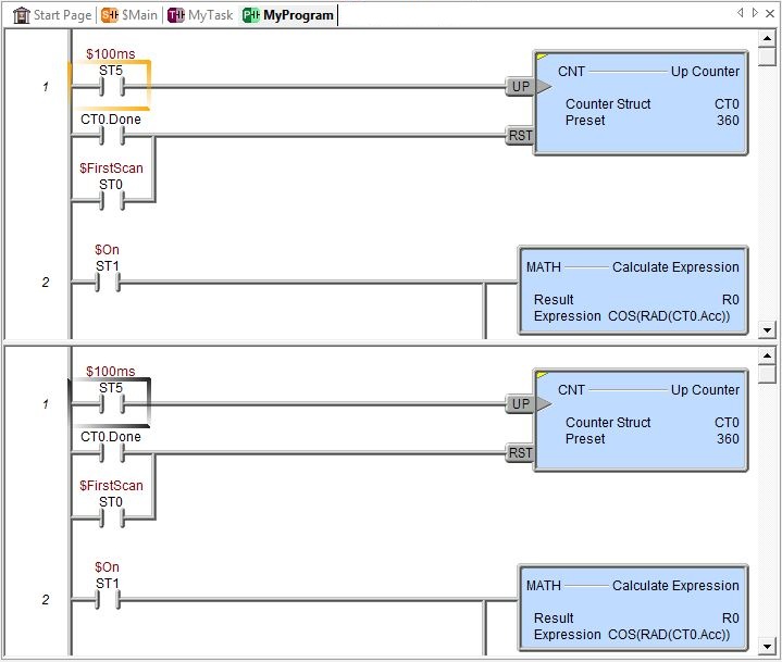
The image above has the screen split into two equal sections.Note: the F6 key will switch focus between the two split panes. To remove the split screen press and hold the left mouse button over the split screen bar. When the cursor changes to a parallel bar appears, move the split screen bar back to the top of the edge of the view.
Cascade and Tile - Horizontal / Vertical
The default layout for the Ladder views is using tabbed views, but Do-more Designer allows for three alternate arrangements, they are: Cascaded, Tiled Horizontally, and Tiled Vertically. The arrangements are invoked by selecting them under the Windows menu, or by clicking the Cascade, Tile Horz., or Tile Vert. buttons on the Window toolbar.
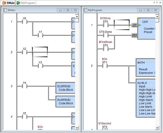
These arrangements place the currently open Ladder views into separate windows that are contained within the Ladder display area. These individual windows can now be independently resized, maximized, minimized, and placed anywhere within the bounds of the Ladder display area. These alternate arrangements can be especially useful when multiple code-blocks need to be viewed at the same time.
To return to the tabbed dialog arrangement, maximize any of the tiled windows. Doing so will also enable the 'minimize / restore / close' icons in the upper-right corner of the main Do-more Designer programming window. The restore icon will transition from the tabbed view back to the cascade / tiled arrangement.
Selecting Window -> New Window (or clicking the New Window button on the Window toolbar) will create a second view of the active view. This allows the programmer to open multiple views of the same code-block that can be used to display different parts of the same code-block at the same time. The different views can be independently managed as to Edit Mode or Display Mode, Status ON or Status OFF, etc.
Note: If you change the contents in one view, all other views containing the same ladder logic will reflect those changes.
Selecting Window -> Default Layout will return Do-more Designers Programming software to the factory default layout.
This will re-Dock all Dockable A Dockable window is one that can be connected to the sides, top, or bottom of another window.
Docking is done by clicking the mouse in the colored portion of the top bar of the window and dragging it toward the edge of the contain window. As it approaches the containing window, a reverse video block will appear, showing how the docked window will appear in its docked form. and Floatable This window can "float" on the screen and remain functional while being unconnected to an edge of a containing window.
Floating a window is done by clicking the mouse in the colored portion of the top of the window and dragging it away from the edge, As the window is dragged away, a reverse video block will appear, showing how the window will appear in it's floating form.
windows and restore the default toolbars and their layouts.
A Dockable window is one that can be connected to the sides, top, or bottom of another window.
Docking is done by clicking the mouse in the colored portion of the top bar of the window and dragging it toward the edge of the contain window. As it approaches the containing window, a reverse video block will appear, showing how the docked window will appear in its docked form. and Floatable This window can "float" on the screen and remain functional while being unconnected to an edge of a containing window.
Floating a window is done by clicking the mouse in the colored portion of the top of the window and dragging it away from the edge, As the window is dragged away, a reverse video block will appear, showing how the window will appear in it's floating form.
windows and restore the default toolbars and their layouts.
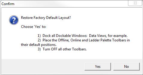
Click Yes to restore the default layout, or click No to retain the existing layout.
Ladder View Information in the Status Bar
Project Differences provides
visual cues when changes have been made to the System Configuration, the
Program, or the Documentation sections of a project but have not been saved
to the Disk or to the PLC.
S (System Configuration) | P (Program) | D (Documentation)
A normal background color for any of the three indicates that the Disk version and the CPU version of the System Configuration, the Program, and the Documentation are in sync.
If the current session is OFFLINE, the three indicators will have a
If the current session is ONLINE, the three indicators will have a
The Program indicator will have a

In the image above, the System Configuration is up to date (normal background), the Program has been changed but not written to disk (green background), and the Documentation has been changed and the changes have not been saved to either the Disk or the PLC. Note: hovering the mouse cursor over the Project Differences section will open a popup that contains a textual description of the state of the indicators.

Program Usage : the number to the left of the slash is the total amount of program memory used by the code-blocks in the project, and the number to the right of the slash is the total amount of program memory available.
Clicking within the Program Usage section will open the System Information utility that displays the total amount of storage space that is being used and available (including program, documentation, and configuration memory).
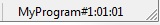
Cursor Location displays the current location of the edit cursor as follows:
the current code-block name # the rung number : the row number : the column number - OUT is displayed if the cursor is in the output column
Using the Cross Reference Tooltip
Hover the mouse over any element reference in any instruction in the Ladder view and the cursor text will change to "Xref" and a Popup Tooltip containing the cross reference information for that memory element will appear. All of the text in the popup are hyper-links (as you move the mouse cursor over them they are underlined) that can be used to navigate through the cross reference information.
Address references in the current code-block are first, and are only the address number. Address reference in other code-blocks are listed with the code-block name and the address, separated by the '@' symbol. Click on any of the address references in the list to go to that specific usage of the memory location.
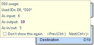
The current address reference is displayed in bold.
Used IDs: lists the previous 2 and next 2 elements of the same address type that are also used in the project, the element in question will have asterisks.
As input: lists the addresses where the element is used as an input to an instruction.
As output: lists the addresses where the element is used as an output from an instruction.
As in / out: lists the addresses where the element is used as an input to an instruction AND an output from that same instruction.
< Prev (Ctrl-) move the cursor to the previous location where the element is used.
Next (Ctrl+) > move the cursor to the next location where the element is used.
Click Don't show this again. to prevent the Cross Reference tooltip from being displayed when the mouse hovers over elements in the instructions. Note: use the View -> Options... -> Popup Tooltips -> Cross Reference to enable the cross reference display again.
Popup Instruction-Specific Tools
Hover the mouse cursor over the wrench icon in the upper right corner of an instruction for 1 second to display a popup containing a list of programming or monitoring Tools that can be used with this instruction. Click on one of the items to launch that specific tool.
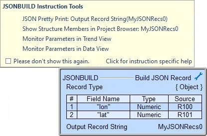
The following is a list of the instruction-specific tools that will appear, based on the instruction, and in some cases, the type of parameter used in that instruction:
|
|
Monitor parameters in Data View / Trend View
Show data in Memory View
Run DmLogger
Show I/O System View |
Show Structure Members in Project Browser
|
Click Please don't show this again. to remove the wrench icon from the instructions. Note: use the View -> Options... -> Popup Tooltips -> Instruction Tools to enable the wrench icon display again.
Click for instruction specific help will open the Help topic for the instruction.
Popup Instruction Help
Hover the mouse cursor over the name or description of an instruction for one second and the cursor text will change to "?" and a popup containing some of the text from the Help topic for that instruction will appear.
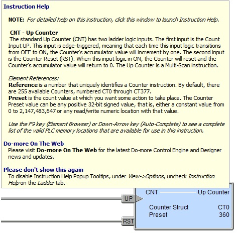
Clicking anywhere within the borders of the popup will invoke the full version of the Help topic for that instruction.
Multi-scan Instruction Flag Help
For instructions that have them, hover the mouse cursor over the colored triangle in the upper left corner the instruction for one second and the cursor text will change to "?" and a popup containing a short description of what the colored flags mean.
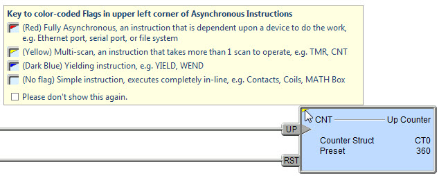
Clicking anywhere within the borders of the popup will invoke the full version of the Multi-scan flag Help topic.
Zoom in / Zoom Out
The amount of information displayed in a Ladder View can be changed by specifying the Zoom level. Each Ladder View can have a different Zoom level. The Zoom level a view is selected through the drop-down menu on the Offline Toolbar. The programmer can select a Zoom level of 35%, 55%, 65%, 75%, 85%, 100% (the default), 125%, 150%, 175%, 200% and 225%.
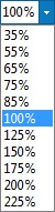
Zooming out (by selecting a smaller zoom level) will display more the ladder logic in the view by making the size of the programming elements and the font size of the rung comments in the current view smaller. More information is displayed, but it is often harder to read individual elements of the program. At the largest zoom levels some of the information cannot be displayed at all.
Zooming in (by selecting a larger zoom level) will display less of the ladder logic in the view by making the size of the programming elements and the font size of the rung comments in the current view larger. Less information is displayed, but the information is generally easier to read.
Scroll Bar Thumb Tooltip
When moving the scroll bar thumb wheel, information about the current location in the project is displayed in the popup tooltip .
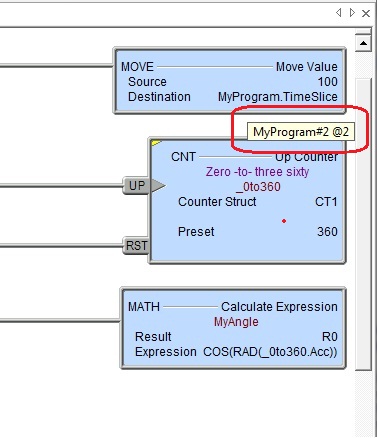
The Status group of the Ladder Options tab has the following selections that control what information is displayed:
Include both Rung # and Address @Offset (default) means the popup tooltip will display the both the Rung number and the Address of the first element used on that rung.
Only include value specified in "Number Rungs..." option above means the popup tooltip will display the either the Rung Number or the Address of the first element used on that rung.
No Text means the popup will not be displayed.
Include code-block name in Thumb Scroll bar Text (default) will include the code-block name in the popup tooltip.
See Also:
Ladder Views